I'm only familiar with Saul Bass' work in the sense that I recognize it when I see it. I wish I had taken a history of graphic design or something like that, because I would love to know more about this designer who designed some of my favorite movie title sequences.
I guess for now I'll have to settle for thoroughly reading his wikipedia page and google's tribute.
Wednesday, May 8, 2013
Great site to look for design jobs!
So Hannah introduced me to designspiration at the beginning of the semester, and recently they added a job board to their site. Since it's a design specific site, it'd be a great place to look for jobs for us designers!
Monday, May 6, 2013
Photo Inspiration

Dinner at sunset with 50 of your closet friends one last time before graduation. Doesn't get better than that.
Thursday, May 2, 2013
Starbucks stickers
Recently at work, I had to do some deep cleaning of the back room and these stickers fell off the shelves. More well-designed Starbucks branding!

Our 3 most popular dark roasts. Interesting that they are all represented by animals.

The rest of the dark roasts. I like Gold Coast's art deco look, but I don't like it as much in the french roast design. Not as well executed, lacks purpose. I can't say I'm crazy about the Italian Roast font, but it fits with the idea. And I like the idea of a little vespa there instead of doing the leaning tower of Pisa or something like that.

Medium/regular blends. I LOOOVE the iced coffee design, so cute and summery. The other three go together nicely, and it is the classic/throwback Starbucks branding, but I like what its moved more towards now.

Holiday blends and Guatemala Antigua. I've always been a fan of Starbucks' Christmas branding. It's fun and festive.
While I'm talking about coffee branding, I came across this picture.

Is it just me, or is everyone and their mother using these two fonts, and especially together? I'm sick of seeing them both. It's not original or cool anymore. Blah, I'm font fatigued.
Wednesday, May 1, 2013
Look at this big ass tree. PHOTO INSPIRATION/EMPOWERMENT
So I feel very empowered today because I changed my tail lights all by myself! YEAH, STORNG INDEPENDENT FEMALE.
Now look at this tree. It's growing all over the place, don't give a crap where, it's like a honey badger.


Now look at this tree. It's growing all over the place, don't give a crap where, it's like a honey badger.
the previously mentioned awkward ging.
if this tree can keep doing it's thing, WE CAN DO ANYTHING GUYS.

Monday, April 29, 2013
Er, post note about script fonts.
So I know I just blogged about how I don't like script fonts, so of course after posting about that, I immediately find exceptions to my previous statement.
AceJet had this post about Found Type Friday.
These are my favorites.


I love this on a baseball tee.
Sunday, April 28, 2013
Design Rules (According to ME): Part 2
My creative, albeit ginger, friend/roommate Kaitlin had a post on her Small Things blog about her design rules. Thought it might be nice to do the same. But I have a lot to say, so I'm splitting into several posts. This is about fonts.
fonts to use
if you are new to picking out typefaces, here are some of my favorites as a starting off point.
serif:


fonts to not use
for one reason or another, i have seen these fonts TOO MANY TIMES, and i'm sick of them. or they are widely regarded as awful.

script
 UGH. i hate script fonts. almost always. i think there are places where they are appropriate, but usually it just bugs me. it makes it look like a wedding invitation to me. usually they are completely unreadable.
  <who can even read that?!
a note about novelty
here's the thing about novelty fonts. there's a time and a place for them. if you have something that is really high concept and you have an appropriate novelty font to go with it, fine. but that's rare. usually i just see novelty fonts and think, "WHYY?!" it ends up looking so kitchy.
some examples:
this one doesn't bother me as much. i could see it being used appropriately in a story headline about instructions or moving or directionality.

this has no godly purpose on earth.
serif and sans serifa pairing of the two is a necessity. serif fonts in body copy are best for readability, paired with a nice clean sans serif headline.
Monday, April 22, 2013
Design Rules (According to ME): Part 1
My creative, albeit ginger, friend/roommate Kaitlin had a post on her Small Things blog about her design rules. Thought it might be nice to do the same. But I have a lot to say, so I'm splitting into several posts.
I agree with her when she says:
"Never, ever hyphenate your text.
I hate hyphenated text. With the ability to adjust tracking, leading, kerning, size, stroke, etc. there is no reason that you can't alter the shape of your text to fit an area or be more appealing. And hyphenation looks janky. You aren't writing a book, you're making art. Don't be lazy."
italicize
 Kaitlin hates italicized text. I think it has a nice place often in subhead. as long as it's a font that is still readable when italicized.
color
 red: i like my red a bit darker, shades of maroon are also acceptable.
orange: i love orange! as long as it isn't burnt orange. that's disgusting.
yellow: can't say i love bright yellow. I usually opt for more of a mustard or gold.
green: green however, i like really bright. lime, kelly or what i like to call "Starbucks" green are all preferable to forrest or other dark greens.
blue: i love all shades of blue. jewel, midnight, cyan, sky, or teal are all fantastic.
purple: don't care too much for it. i'd rather have blue.
I agree with her when she says:
"Never, ever hyphenate your text.
I hate hyphenated text. With the ability to adjust tracking, leading, kerning, size, stroke, etc. there is no reason that you can't alter the shape of your text to fit an area or be more appealing. And hyphenation looks janky. You aren't writing a book, you're making art. Don't be lazy."
italicize
Kaitlin hates italicized text. I think it has a nice place often in subhead. as long as it's a font that is still readable when italicized. color

orange: i love orange! as long as it isn't burnt orange. that's disgusting.
yellow: can't say i love bright yellow. I usually opt for more of a mustard or gold.
green: green however, i like really bright. lime, kelly or what i like to call "Starbucks" green are all preferable to forrest or other dark greens.
blue: i love all shades of blue. jewel, midnight, cyan, sky, or teal are all fantastic.
purple: don't care too much for it. i'd rather have blue.
Creative Inspiration
It's getting to the point in the semester where I feel really exhausted creatively. So I've been looking for new sources of inspiration. Where do others go for inspiration?
I ended up finding a nice series of videos from lynda.com. In their words, "lynda.com Creative Inspirations documentaries follow creative individuals and companies that are leaders, entrepreneurs, inventors, experts, or pioneers in their fields." Most of them I haven't heard of, but hey, you don't really get in this business to be famous.
Today I watched this one about Ed Emberly. He's the artist that taught you to draw as a young child using basic shapes and thumbprints. Unfortunately the video is only available to view if you have a Lynda account, but they do have a free trial!
Saturday, April 20, 2013
Things I Wish I Had Known About InDesign
So I came across this article, Things I Wish I Had Known About InDesign When I Was First Starting Out.
I know our class is pretty advanced and probably already knows most of these things, but in case you don't, take a gander. Has anyone else discovered any tips/tricks they had known sooner?
One thing I want to add is true in all Adobe programs. With so many fonts out there, it can be really daunting to pick one when you are just starting out. I wish I had known that I could highlight the word, and then click in the text box, and use the down arrow key to scroll through the fonts.
Thursday, April 18, 2013
Photo inspiration

So I know some people are really into monograms, and I never really have been. Probably because I see the same design everywhere, and it looks so sorority. A friend of mine found this in a restaurant and sent it to me. Holy monogram, Batman! I am considering this a challenge to design my own monogram, and am using this as inspiration.
Sunday, April 14, 2013
Photo... inspiration?
So I had a pretty scary moment on saturday evening. A group of friends and I went to this country store restaurant out in Ashland (south of Columbia, halfway to Jeff City on 63). It was a fantastic restaurant and a great time until the drive back to CoMo. On the drive home we hit a deer on the highway. Everyone was ok, but my friend Katherine's car was totaled. It was a really scary thing for me, I've never been in any kind of car accident before! Just got me thinking about life.

her totaled car.
sorry for the depressing post. : /
Saturday, April 13, 2013
Check out my awesome designer friend!
Hey, if you're looking for a good example of a cargo collective portfolio site, check out my roomie and pal Emily's porfolio. She's a senior in the graphic design program here at Mizzou.
My favorite project of hers? These fashion playing cards.

Makes me wish I had been an art major instead of journalism!
My favorite project of hers? These fashion playing cards.

Makes me wish I had been an art major instead of journalism!
Friday, April 12, 2013
Drunkorexia covers
This past week I had covers due, and the story was Drunkorexia. Basically it was about girls who don't eat/eat less calories during they day so they can consume more calories in liquor form later.
I can't decide if designing all of these alcohol related stories is driving me to drink, or if I never want to look at another bottle of liquor ever again.

I really loved this look so there are several versions of it.


this idea just didn't quite pan out like i thought it would.

slight improvement.

i really liked this one best, i wish i would have used the hed of "you are what you drink" instead.

this was created because i am out of other ideas.

i was a little surprised that this was chosen as the one for me to keep working on.
but also, this feature was moved to a later week so i have a bit more time to work on it. which is good, i'll need the extra time.
Thursday, April 11, 2013
Wednesday, April 10, 2013
I knew I first wanted to be a designer when..
This interesting post from AceJet posed a good question: when did you first decide you wanted to be a designer?
I thought it would be an interesting conversation topic. SO COMMENT YO.
I first realized I wanted to become a designer way back in high school.
I joined the newspaper staff in high school not really knowing what I was getting into. For lack of dedicated staffers, I was immediately made an editor. I crash coursed through InDesign and never looked back. I knew I could live my life creating things in this program and never grow tired of it.
How about you all?
Tuesday, April 9, 2013
Books Redesign
So when I was on spring break I've noticed a lot of book cover redesigns. I'm all about this, as it combines my live of reading and design.
I am, however, an advocate of content driven design. So when I see a book cover and I don't immediately "get" where the concept is from, I have an issue with that.
There's so much to draw inspiration from, so many visual things from the story I just don't understand why you would use a random pattern.
Maybe I'll do some redesigns of my own. MAYBE I WILL.
Alice in Wonderland literally has so many FANTASTIC visual elements to draw from, it inspires designers everywhere. I don't see the point of just polka dots.
Feathers? Pride and Prejudice? Are there birds a big thing in this book and I don't remember?
....yes.
you're starting to lose me, anthropologie.
.... don't. i can't even.
YES. TEAPOTS. WE ARE GETTING THERE. GOOD JOB.
ABBIE STAMP OF APPROVAL.
Sunday, April 7, 2013

Friday, April 5, 2013
Can't Miss: AceJet- The only way is ethics
An AceJet review of a book can get me excited about anything.
This book is going to be made into a film. The work is the designs of Ken Garland, whose designs have obvious Swiss type influences mixed in. There's also a bit of late 70s early 80s vibe to the designs included in the book.


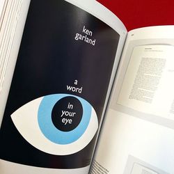
This book is going to be made into a film. The work is the designs of Ken Garland, whose designs have obvious Swiss type influences mixed in. There's also a bit of late 70s early 80s vibe to the designs included in the book.
Wednesday, April 3, 2013
Chchchcheck it out! Pixel app
Recently, AceJet posted about this pixel app.

AceJet raved about it, but I don't personally care for it. To me making my pictures unrecognizable is several steps worse than Instagram.
The site says "With the help of pxl it is very easy to create a new avatar picture or a unique background for your iOS device!"
I don't really want my avatar to not look like a person. Perhaps for a background, but I'll stick with the one I've got.
This isn't really my style, what do you guys think?
Can't Miss: AceJet Transit Maps
I know everyone loves maps of mass transit systems, a well designed one almost always ends up as a poster.
I think this post by AceJet is neat because it shows every step along the way of the planning process. And since so many people love New York, I thought this would be a neat thing to share. Enjoy!
I think this post by AceJet is neat because it shows every step along the way of the planning process. And since so many people love New York, I thought this would be a neat thing to share. Enjoy!
Tuesday, April 2, 2013
Photo Inspiration 4/2
Last week I had the pleasure of visiting beautiful and historical Charleston, SC. It wasn't quite the warm sunny beach scene I hoped it would be (like the picture I posted last week), but it was still a good time! Lots of beautiful things to see.
 Charleston has the nickname of "The Holy City" because so many church towers dominate the skyline.

Beautiful architecture everywhere.
Sunday, March 31, 2013
Niftayyyy Restaurant/Bar Findings
Last week while I was in Charleston, I felt like they had SO many awesome restaurants and bars. I know I was in a tourist area, but I think Chucktown is quite the fine dining city. The thing I thought I would share though, was the great design elements from these restaurants! You know when you go somewhere, and you can hardly look at the menu because it is so poorly designed? That was not the case in Chucktown! Also, most of the bars we went to had such fun/funky decor. Made for a great bar atmosphere!


This bar, Closing Time (what a GREAT name for a bar), had a lodge feel mixed with Route 66 diner. It was what my pals like to call a honky tonk bar, but we had a blast there.
Ok, this restaurant was terrible. We just wanted margs and chips and salsa, and they did NOT have unlimited chips and salsa. THEY ONLY SERVED TACOS, IT WAS AWFUL. But, it had cool decorations and nice company branding.
It was too dark to get a picture of the awesome interior at this bar called Speak Easy (which may have been an actual speak easy in the prohibition era? or maybe its just their "thing" but it fooled me.). So I am instead sharing my amazing drink from there, called Spring Fever. IT HAD ACTUAL ROSEMARY IN IT. shit was cray.

For our one "fancy" dinner of the week, we went to a seafood place called Hank's. It wasn't that fancy, but it was expensive. The back of the menu had a map of all the swankiest/most scandalous/famous bars/joints/clubs of Charleston.

My roommate loved the napkins so much she stole hers. Classy broad.
Sunday, March 17, 2013
App recommendation/review: What the font?!
So a regular feature I'm going to start doing is app recommendations.
This week: What The Font?!

Splash page.
You start by taking/uploading a photo of a font that you have seen and love and want to know what the eff it is! This happens to me all of the time.

After uploading/taking a photo, you crop to highlight one word. It's best to take the photo straight on, without any tilt or angle to the photo. Also, no glare is preferable.

The app then guesses what characters it "sees." This is where the app is lacking in my opinion. It's not very good at recognizing characters, as you can see.


This week: What The Font?!
Splash page.
You start by taking/uploading a photo of a font that you have seen and love and want to know what the eff it is! This happens to me all of the time.
After uploading/taking a photo, you crop to highlight one word. It's best to take the photo straight on, without any tilt or angle to the photo. Also, no glare is preferable.
The app then guesses what characters it "sees." This is where the app is lacking in my opinion. It's not very good at recognizing characters, as you can see.
After correctly identifying characters and selecting identify, it gives font suggestions. It's not entirely accurate, but it gives some close ones that will do the job most of the time.
Overall, this app isn't the best designed or functioning app, but it does what I need it to do. It's a great idea. I'd love to know if there are any other apps with similar functions that are more effective? Let me know y'all.
Subscribe to:
Comments (Atom)